Presenting Data

Just some thoughts while I've been working through the DAND course. The final project that is submitted at the end of Term 2 is a visualization of story of data analysis with the use of Tableau. Students who have been completing their final project have been posting them and asking for feedback on their capacity to tell a story. Tableau is pretty cool and can do all sorts of fancy things, but something that has been fascinating to me is realizing how deceptively tricky it is to tell a data story. Especially if you can't speak to what you are presenting, the user needs to understand it just from what is there, with limited additional text.
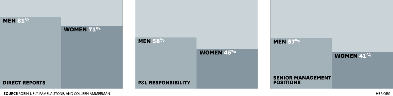
At the same time as the student presentations started popping up, I came across this HBR article. It looks at the variables that compares the amount male and female Harvard MBA grads working in 'high responsibility' positions, and the factors that appear to impact this. While the subject matter is of interest to me, what I found more interesting was their presentation of data and analysis. In reading the article it was obvious that they had conducted incredibly sophisticated analyses, but they never got caught in the weeds, whether it was in the details of the analysis, or in the presentation of the data. It's fascinating to realize how possible it is to present complicated concepts in a simple fashion if you really work on it! Definitely something to aspire to. :)
This is one of the very simple, but strongly communicative, graphs that they presented.