Effective Visualizations

I think that the presentation of complex data can quickly end up causing the user to feel overwhelmed with the required interpretation. There is too much going on, and they can feel uncertain how to apply the information.
We had a great article for the presentation of data posted in our Slack channel, this time specifically using Tableau. The articles starts off with a number of different quotes related to using data to tell stories. I think my favourite is the first one, "People hear statistics, but they feel stories," because it resonates with me deeply. Coming from a field where people can be hesitant, or at times even suspicious, to embrace data, telling stories is my go-to strategy. What I liked most about this article were both the variety of graph types shown, but also how these were connected to interpretation and recommendations.
Some of my favourites
Prediction models
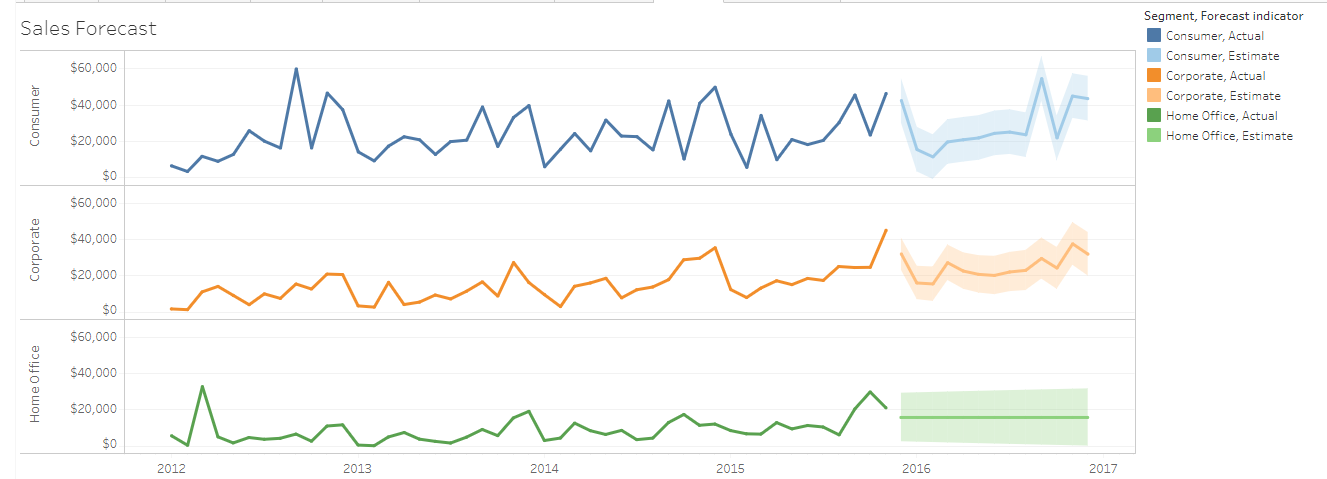
With the narrative:
According to our past and current sales and seasonal pattern, we can forecast sales for 2016 like so.
The model has determined that there is a 95% likelihood that the value of sales will be within the shaded area for 2016.
As you can see, February is typically is a slow month for consumer and corporate products.
Shall we plan a promotion for that month?
I like this because it very clearly shows the variability in the ranges for the models used without getting caught up in statistical jargon.
Multiple variables over time
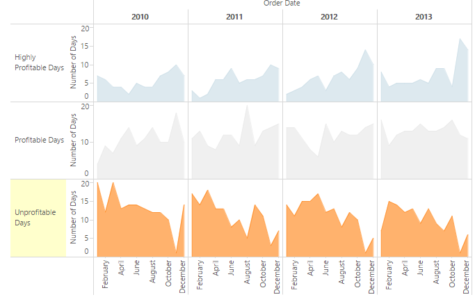
With the narrative:
Our unprofitable days are more likely to occur in the early months of the year ( January to March).
Let’s look for ways to up-sell each customer for these months to make us profitable.
What I think they have done well:
- Present three variables in a way that allows each to be easily distinguished and individually examined
- Allow for smooth visual processing from year to year, while also keeping each year distinct
- The inclusion of the area shading assists with comprehension
- Highlight the variable of key importance: Unprofitable Days
- Provide a clear recommendation for adjusting behaviour/practice based on the data
"On track" comparisons
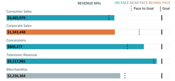
With the narrative:
Consumer sales is 5% ahead of the pace; this is likely driven by our newly opened store in Toronto.
Corporate sales is well-behind the pace as expected due to the resignation of two sales reps.
Merchandise is 5% behind the pace; consider replacing two sales reps as soon as possible and re-allocating the advertising budget to Merchandise so we can hit the revenue goals by the end of the year.
What I like about this chart:
- The density of information provided without being overwhelming
- The formatting of the various graphical elements that create a very clean visual style
- The recommendation that targets an achievable action based on the data