What am I Supposed to do in EDA?

I've been chatting with a couple of my fellow DAND students and something came up. The general question was something like, "Ok, I get that I do some visualizations to explore data, but I'm not certain exactly what I'm supposed to do with a new dataset." This is what we do in EDA, or, Exploratory Data Analysis. I read a post recently that if you've given a piece of advice at least twice you should write a blog post, so I thought I'd set out to try and write something to explain it, or, at least explain how I think about it.
I have two other resources that I've used to help guide my thoughts on this. One is an insightful discussion on some practical guidelines on model building. The other is a 'mind map' of the different components of data exploration for explanation and prediction.
What's the Plan
I'm hoping to be able to do a number of things:
- Walk through the general process of univariate, bivariate and multi-variate exploration
- Discuss the types of plots that can be used for different types of data
- Use one of my "previously prepared" projets to help with a practical example
Project Intro
If you haven't seen the project I'm going to use as my example, you can find it here. I looked at the relationship between presidential election results in Ohio and the contributions that were made to the candidates. Each entry within my dataset was a single contribution made to a specific candidate with other pieces of information attached.
As we go through, the areas that relate to my project will have a dark blue color to contrast to the general information.
Univariate Analysis
Always start with univariate analysis.
Pretty much anyone will tell you this, but the question is, why?
The answer is, because you truly want to be able to understand your data on each variable/factor that you have. Exploring each variable individually allows you to understand the basics of how that variable functions and helps you identify whether there are any interesting elements within the variable. What is interesting? Any number of things, but can include:
- Extreme changes in numbers
- Distributions that are different than expected
- Large skews in distribution
What do you actually do in univariate exploration? It can depend on the types of data you have.
Categorical
Univariate plots for categorical variables are typically counts. You plot the number of entries within each category of a variable. This can be done with bar charts (more common) or histograms (works with large numbers of categories).
For histograms, one of the areas to consider is binning. That is, how many ranges should be grouped together to create the frequency plot. Often statistical packages will have quite a large range and it can be good to experiment. Bins of 1 can be helpful to see all of the detail of the frequency, but if there are known common groupings of the variable, that can also be appropriate.
At times if you have many categories within a single variable you may also want to group them for plotting purposes. For example, it would be possible to group the number of contributions per person into low medium and high and either plot those three categories, or plot histograms for each of those new classifications.
The goal is always to use plots that help you best understand the data. There may not always be one ‘right way’ to do this. It is about “getting a feel” for your data and familiarity and instinct in this regards can take time.
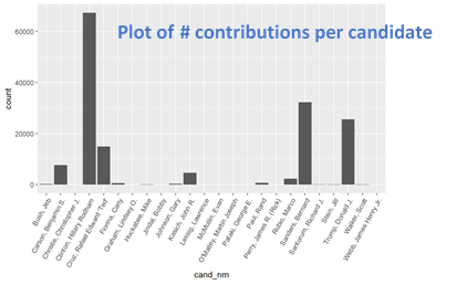
In my case I had multiple categorical variables:
- Candidate name
- Candidate party/political alignment
- Election type
- Contributor name
If there were a small number of categories, such as was the case for candidate name, party and election type, I would use a bar chart to plot the number of contributions that were found in each category.
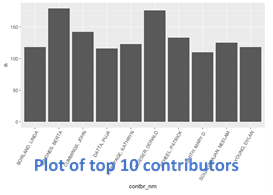
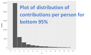
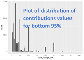
For contributor name there were many contributors/categories. In this case, I created a histogram plot of the distribution of the number of contributions per contributor. If I discovered that the histogram was highly skewed I would often plot the counts of the top 5-10 categories and then I would do a histogram of the bottom 75-95% depending on the skew. (I would typically decide by running the different quantile limits to get the type of plot I was looking for)
Geographic Variables
I would consider geographic variables a special type of categorical variable. You can deal with them the same way as regular categorical variables, and plot bar charts and histograms, but you can also plot them on maps.
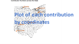
If you can obtain latitude and longitude information, plotting geographical information can be as easy as plotting a scatter plot with the latitude assigned to the x-axis and the longitude assigned to the y-axis. Each point can be plotted for it’s coordinates. If you discover there is a large amount of overplotting (lots of dots on top of each other), you can change the alpha for the dot fill and/or add jitter to the points.
Geographical variables have their own kind of “binning”. Data can be binned by individual point, by county, state, country, continent or region. Again, the point is to use the types of binning that best help you understand the data.
When plotting geographical data it can be helpful to plot and label some known landmarks such as capitals or large cities to help orient yourself.
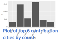
My geographic variables were:
- Contributor city
- Contributor county
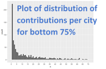
For city I used a bar chart for the number of contributions for the top six cities, plotted a histogram of the number of contributions per city for the bottom 75% of cities, and then plotted all of the contributions on a map (using coordinates) to see the spread across the map.
Continuous/Numerical Variables
Histograms are also a good univariate exploration for numerical variables. Again, pick a bin size according to known groupings for the variable, or play around with the bin sizes to see what best helps highlight the variations in the data. You can also frequency polygons and smoothing techniques.
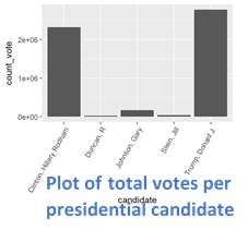
In my case my numerical variables were contribution values and vote counts.
I plotted a histogram with bin sizes of $5 for the contribution values and plotted the total count votes for the candidates.
(For candidates, I could have done the distribution of votes per count for each candidate, but this worked best for my purposes)
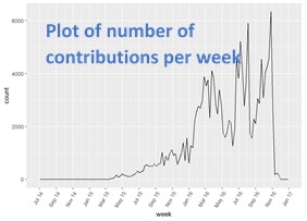
Date Variables
Date variables are also a special kind of numerical value. For date variables I like to plot a frequency polygon because it gives a visual depiction of flow over time, but histograms are also appropriate. Binning/smoothing here is definitely important but you typically can’t use the same code functions that you used for regular numerical values. Pick a bin size that captures the variation in the data without making it so messy that interpretation becomes difficult.
In my case I had a date for each contribution and so I plotted the counts for each week.
Summary
Other things that you may want to with your univariate analysis include running descriptive statistics like counts, min, max, mean, median, mode, quartiles and standard deviations. What ever you need to help you better understand the nature of the data you are exploring.
You want to do the univariate analysis for any variable that you think could be useful further down the line. The goal with all of this plotting is to get to the end, and be able to answer the question, "What do I know about my data?" You also probably want to be able to also answer the question, "What do I want to explore further in my dataset?" This means that after each plot you should add some kind of text that explains what you observed from the plot. This will give you a great foundation for moving into bivariate exploration by providing an understanding of how each variable 'operates/feels' while also pointing you to where you might be looking for further exploration.
Note that for all of these plots, what is being plotted is counts of something. This is typically the case for univariate plotting. It’s also typically the case that you won’t be using color for univariate plots because that would suggest at least two dimensions are being examined. You might also notice that these plots are quite 'rough' in their formatting, because this is the exploratory phase, it's fine if these are more 'rough and ready' in presentation.
Bivariate Analysis
Pairwise Plotting
In bivariate analysis you start combining pairs of variables at a time. I find that starting with a pair-wise plot matrix can be a great way to start and to gain further insight into what you might want to explore within your variables.
My pairwise plotting looked like this:
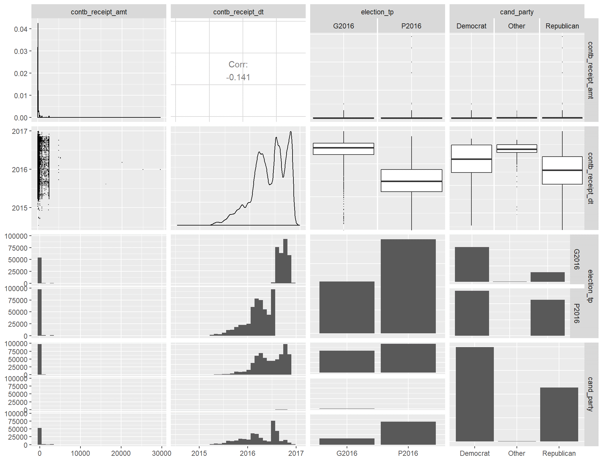
I went through each column and then moved down row by row and made some basic observations about what I saw for each cell. This may not be 100% necessary but it did give me a good handle on what to expect from the data.
What Next?
There are two ways you can move forward from here. You can either move straight to the primary relationship that you are looking to investigate, or you can start exploring the interactions between the 'other variables'. Regardless of which one you start with, you will want to do the other as well. Both are needed to give you strong insights into your data.
In my case my primary relationship was the relationship between candidate vote counts and contributions. Identified my relevant 'other' variables as:
- Political alignment of the candidate
- Date of the contribution
- Where the contribution or vote was made
- The type of election to which the contribution was made
I started with the relationships between the 'other' variables. Some of this was practical - I had vote counts in a separate dataframe and didn't want to a combined version at that stage (so the variables weren't connected for pairwise plotting). However, I also thought it would be a good idea to get a strong handle on the side relationships to better understand the main relationship.
Using Colour
Bivariate plots are when I like to start adding colour, but there are some tricks to doing it well.
The first thing to keep in mind when using color is that it is best kept for indicating a categorical variable. It can be easy to add colour simply for more 'interesting' plots, but reserving the use of color can help identify data trends more easily. The other thing to keep in mind is that adding color automatically adds a second dimension, so it's good to be mindful of just how many variables you are exploring at once.
My personal exception here is in plotting elements that are the 'same'. For example, if I am going to plot the mean of something multiple times, I may use a colour and continue that for all of the plots to give other users a subtle hint about what is being plotted. This would be in contrast to a color for plotting the mean.
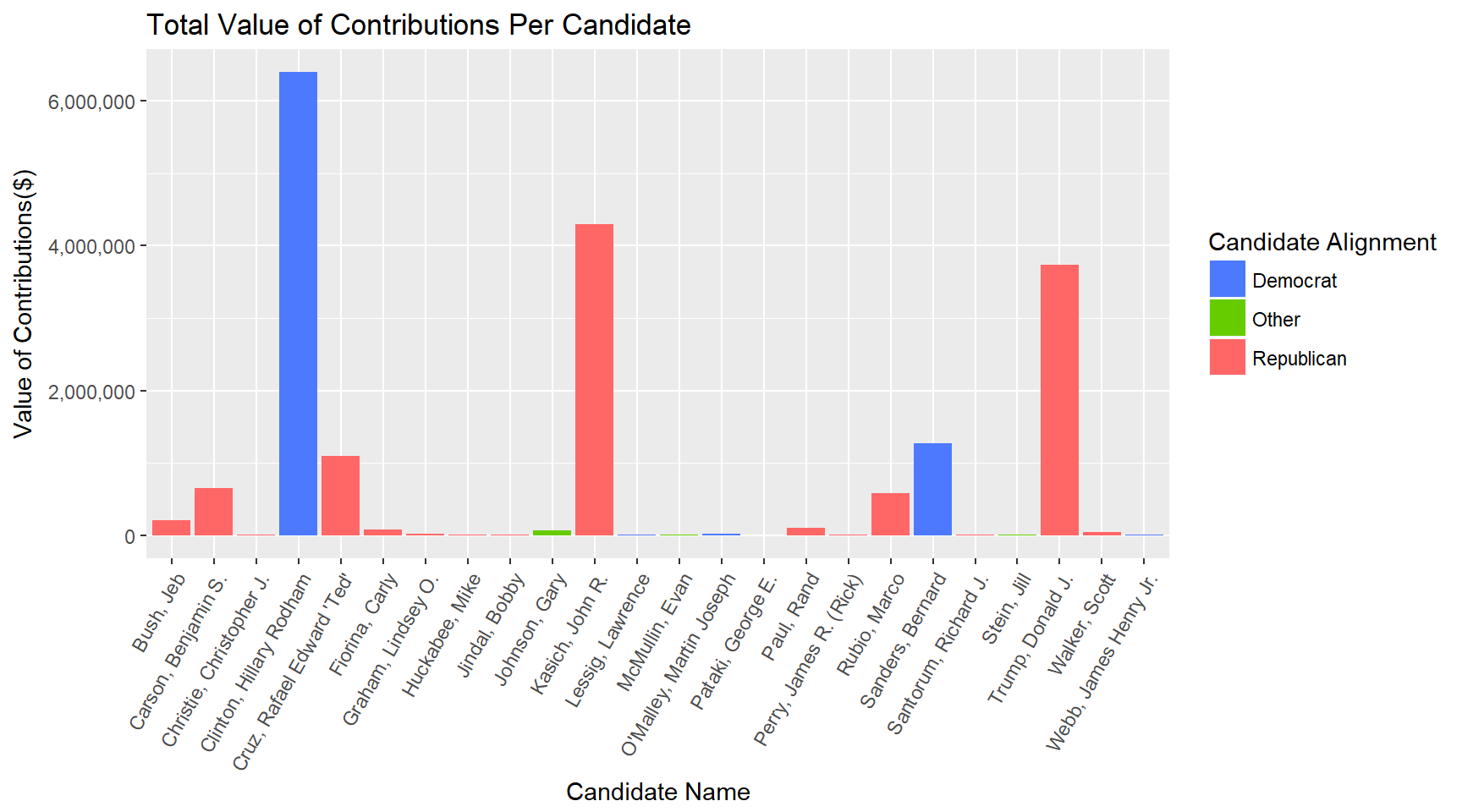
My first plot used color with a bar chart to show candidate alignment (categorical variable) with the value of the contributions (numerical variable) that they received. "Value of contributions per candidate" was one variable, and "candidate political alignment" was the other.
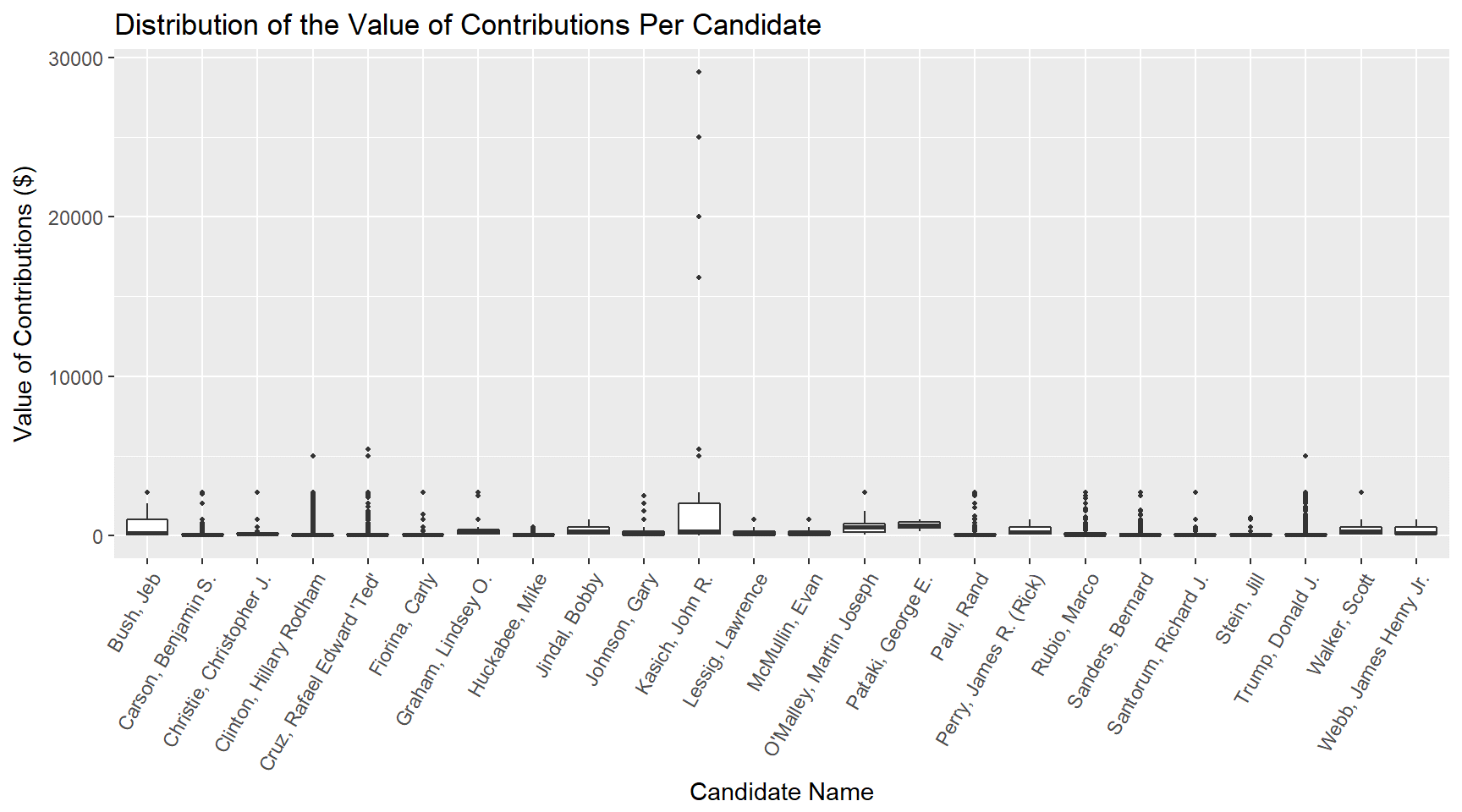
I wanted to look at the distribution of contributions as well as the total candidates. To do this I plotted a series of boxplots. The first showed there were some outliers for one of the candidates and so I did a second plot to limit that and get a better look at the majority of the data.
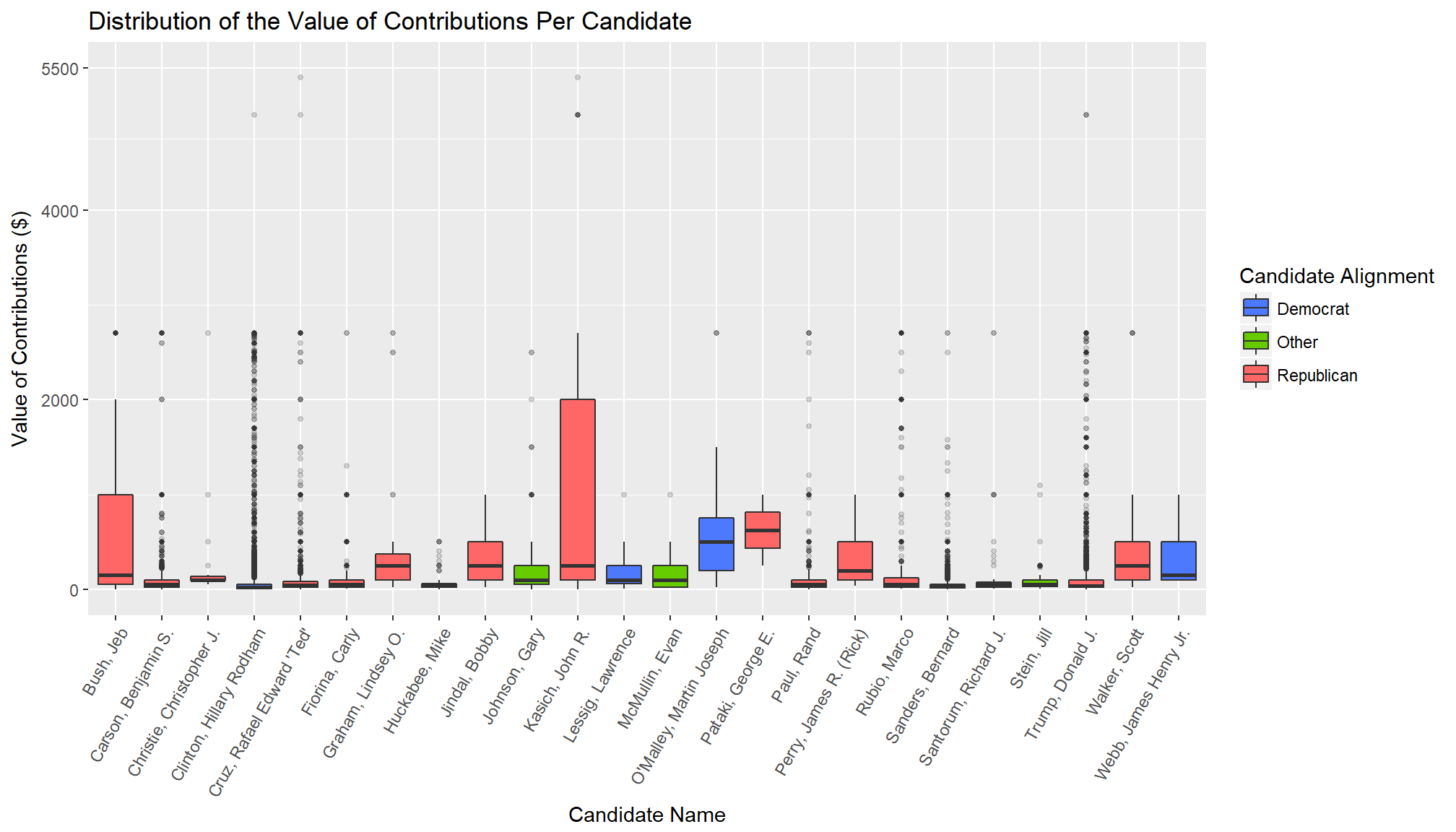
As you will notice, I snuck colour into this one. Technically this is three variables - there is the candidate name (x-axis), the contributions received (y-axis), and the political alignment of the candidate (colour). The reason I included it was because I wanted some visual connection through a series of plots because there was a lot of candidates and if you were just relying on the names it could take a while to match them. Adding the colour made this faster so I did a small 'break the rules'.
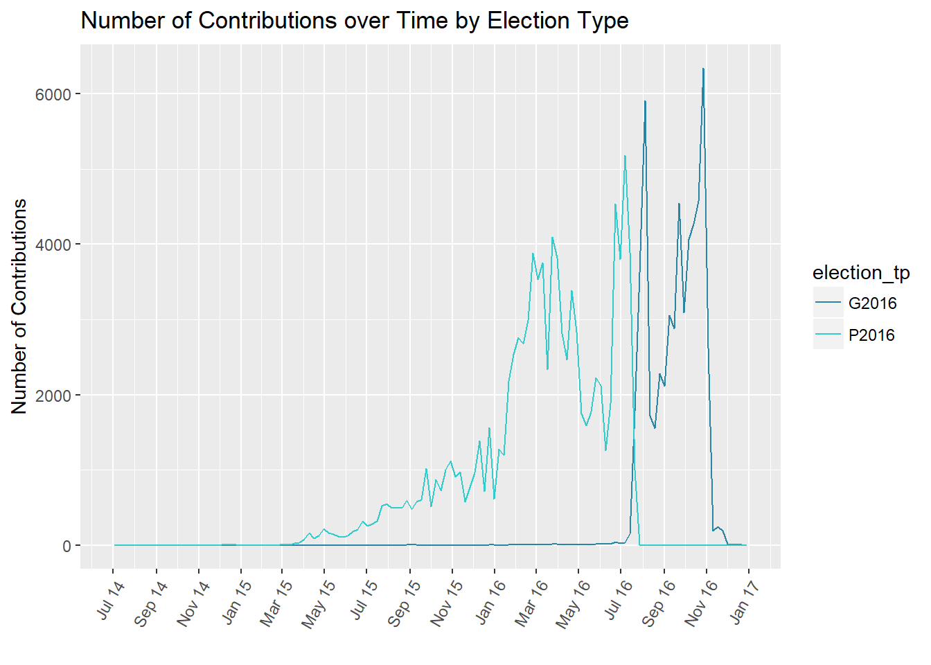
While I snuck the colour in for ease of interpretation, in the rest I was careful to plot two variables at a time. In this example you can see a plot of contribution timing by election time. By the color for election type I have already added a variable and so just plotted counts instead of values of the contributions.
Building on Plots
A lot of bivarite plotting is building upon what was done in the univarite plotting. If you plotted the count of a numerical variable, then bivariate exploration is the time explore the numerical variable. It means that your plots can look similar - clear labelling of your axes and potentially some verbal descriptions can be helpful to distinguish.
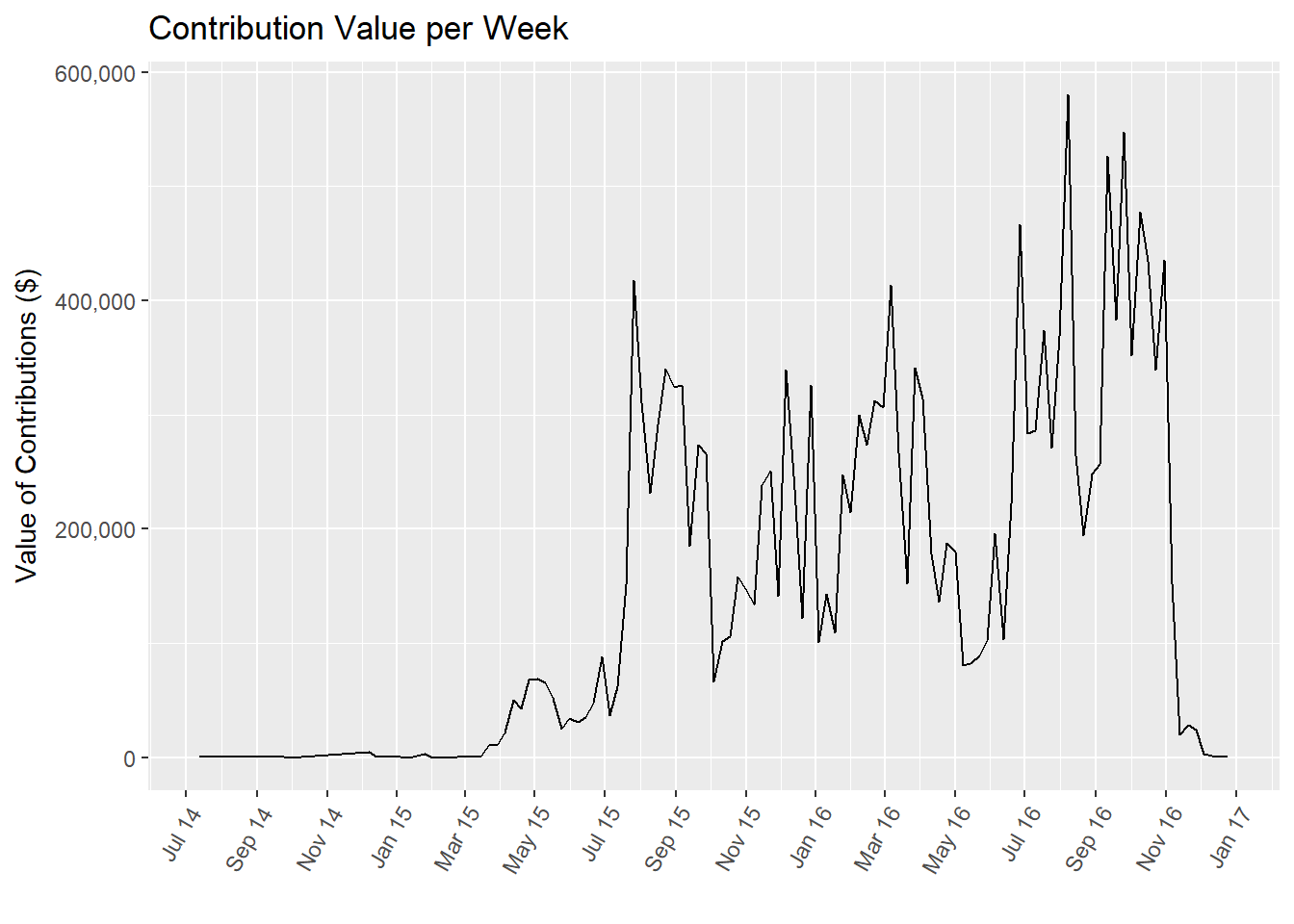
One example of this in my project was contributions over time. I had used a frequency polygon for the contribution counts over time. When I wanted to do the bivariate analysis, I now used a line chart of weekly contribution totals (the same bin width that I'd used for the frequency polygon). If you scroll back up, you can compare the similarities and differences between the two plots.
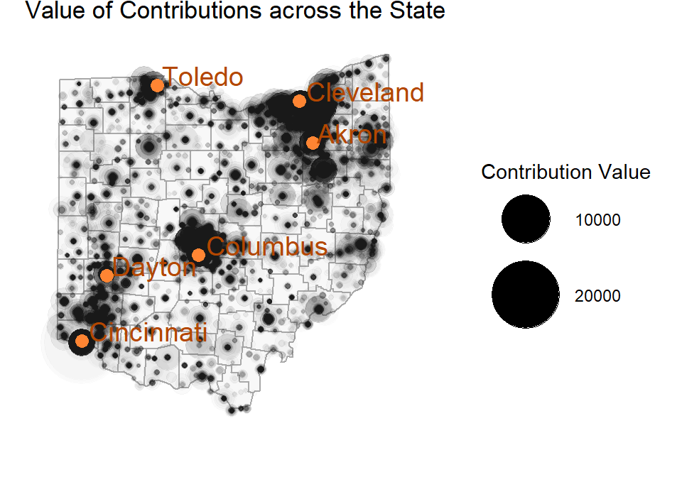
Displaying Size
In addition to colour as an extra element you can use to plot, another element you can use is the size of your points. These are often called bubble plots. The larger the circle, the bigger the value of what is being displayed. This is often combined with a scatterplot, so just a reminder that if you combined size with a scatterplot, that is three variables.
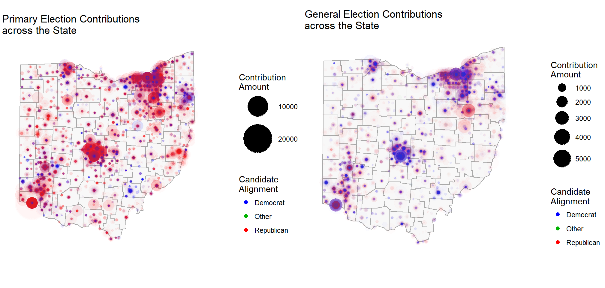
In my case I wanted to be able to show the size of contributions across geography. I added an alpha level to the points so that a single contribution was very light, but many contributions layered on top of each other would be very dark. You can clearly see the areas of concentrated contributions.
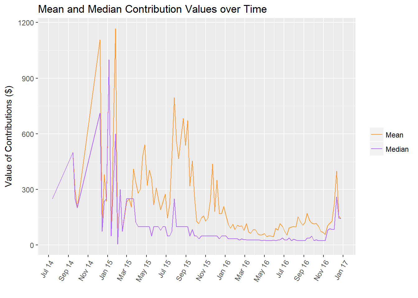
Another way that I can build on plots is also to explore means and medians. Totals can give you the overall picture, but means and medians can give you information about the 'typical' values.
In this case, I plotted them both on the same chart to compare how the peaks changed.
Scatterplots & Regression Lines
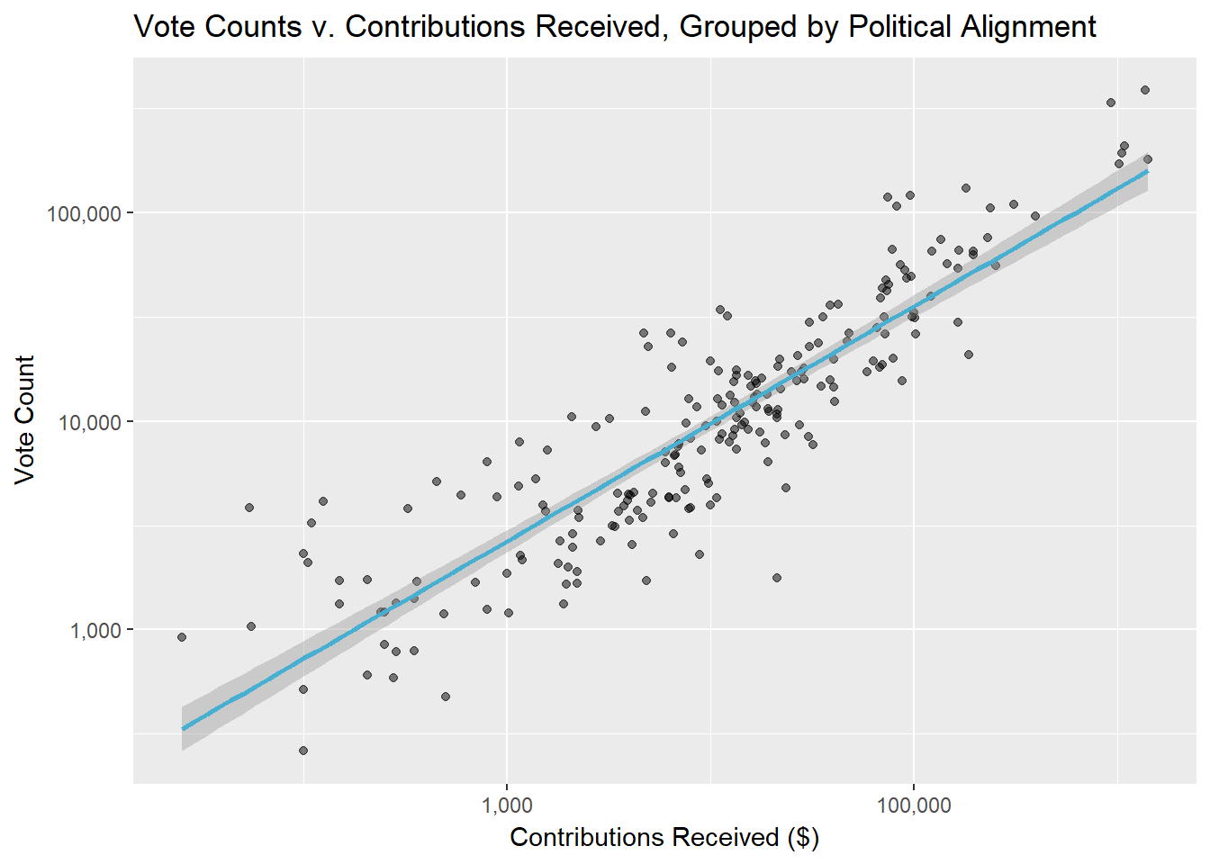
Scatterplots are specifically used for plotting the relationship between two numerical variables. Sometimes ordinal variables (e.g. numeric rankings of things that are really categories) can seem like numerical variables and to be used in scatterplots. Do not be confused!!
When you are plotting scatterplots, you may also want to add in regression lines and run statistical tests of the significance of correlations. This is also the time when your identification of highly skewed data is helpful. If you want to calculate correlations, your data shouldn't be highly skewed. If it is, you'll probably want to log10 transform one or both of your variables. (Log10 is nice because it's not too hard to understand how the transformed variables connect to the original variables)
Particularly when I'm using log transforms I pay a lot of attention to the breaks I use on my scale to help people easily interpret the values they are seeing.
In my case, I originally plotted the contribution and vote count variables, realized they both needed to be transformed, and did that. I was planning on using the data for predictions, so when I added the regression line I added the error spread because I wanted to see how it varied across the range of data, but it's not required.
Summary
Again, you're going to be talking about your observations between each plot, and also pulling your thoughts together on what you have seeen and where you think you should be going. Depending on your data/situation, sometimes this is also as far as want/need to go. Once again, the point here is all about doing things that help you reach your analysis goals - Why are you doing this? What questions are you trying to answer?
Multivariate Exploration
Honestly, when I get to multivariate exploration, I feel like, "And now the real fun begins!" Prior to this I often feel a bit constrained and like I need to hold back a bit on what I am doing, but when I hit multivariate I feel like I can let lose and go where the data wants to go. It's still good to do things step by step because, especially if you are modeling, you are going to be adding each level of your interaction, so you need to have a good sense of what is going on.
Multivariate plotting means that you can start doing things like including colour when you're plotting two variables, or change sizes in a scatterplot, or potentially use different markers.
Faceting
Something that I found incredibly useful when I started getting deep into the plotting is facetting. The way I describe facetting is to say that you make a particular plot. And then you say, "Now replicate this across the categories of this variable." I find this incredibly helpful in putting two plots side by side and comparing how the relationships between the variables operate.
One example of this from the project is adding election type with the value of contributions over time, and political alignment.
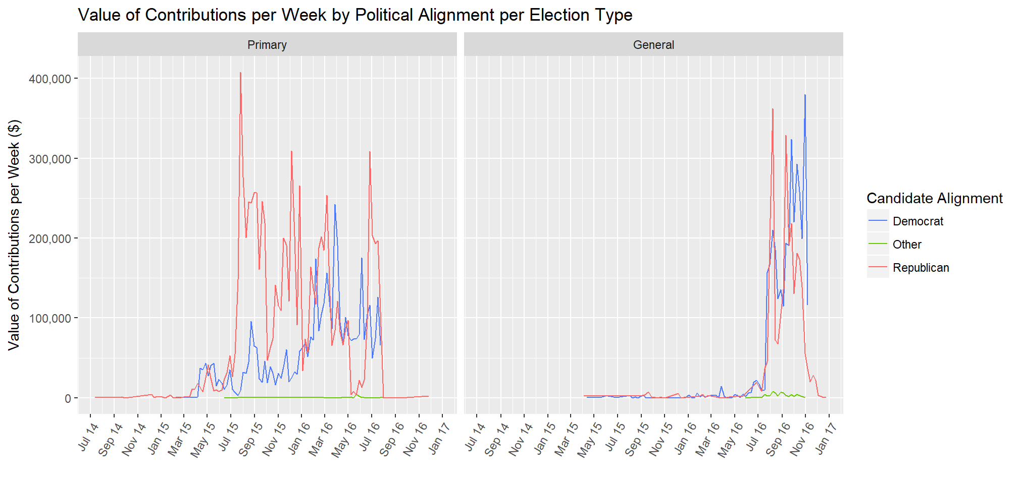
I originally created the plot with the colours for the political alignments and then wanted to see how election type impacted the lines. When the two plots are side by side it became clear that contributions were made at different times.
Just for repetition's sake, here's another faceted plot that I used, this time with scatterplots. When I'm doing this faceting, I compare how the slopes of the lines differ between each other, and what that means for the relationships between the variables.

Here's what I said:
The interaction between candidate alignment and predictions of vote counts functions similarly for the primary election as it did for the combined data, but for the general election the, the point at which they cross over is much higher. That is, for the general election contributions, it takes until approximately $100,000 in contributions received (comapared to approximately $10,000 in the primary) for the prediction of votes for the democratic candidate to exceed that of the republican candidate.
One of My Favourites
This kind of fits with what you can do with the combinations of the above, but really, I just added it because it's one of my favourite plots from the project. I didn't actually facet these and instead just assigned them to variables and arranged them together. But the give some sense of what can be done with the various charting tools.
Summary
When you get to the end of your multivariate plotting the goal is to really be able to say what is happening with your data. You should be able to talk about all of the little intricacies of what is happening with your data.
Final Thoughts
When we were learning about p-values and hypothesis testing, one of the things that I would say to people is, "Don't chase a significant value, find out what it is and state that." It has now developed into the wider concept of, "Don't try to make the data 'say things,' find out what is there.'"
I have developed a somewhat whimsical metaphor for the whole thing:
When you talk to sculptors of stone and wood, one of the things they talk about is not trying to impose an image on the material, but studying it and discovering what is there and bringing that to light.
This is what I think of when I think of EDA.
The goal is not to have a specific visualization in mind that you are trying to achieve, or to convert the data towards a specific result, the goal is to understand the data.
To pick it up and look at it from a variety of different angles, to get a better feel for the shape of it.
To start to hone that and chip away what is excess and is hiding the true images that are held within the medium.
That is how I feel about EDA and data analysis.
Obviously there are actually many stories in a dataset (which kind of makes it cooler than stone or wood, with which you only get one shot), and people can definitely find contradictory positions from the same data, but I don't think that strips away from the general concept of, "Find what is there, and bring that to light," rather than trying to impose a particular idea on the data.