Finding Customer Segments

One of the cleverest realizations within marketing was to recognize that because there are different types people, they are often served best by different products or variations. (If you've never heard Malcolm Gladwell talk about the origin of different types of spaghetti sauce, this is worth reading.) Being able to effectively segment your customers can help you better tailor your services to meet their needs or identify areas of the market that you have not yet engaged (or could improve upon your engagement). One of the methods that is used in customer segmentation is Principal Component Analysis or PCA.
This was my final project of Term 1 in my Data Scientist Nanodegree and I was super excited. A very long time ago I learnt how to do factor analysis in my statistics classes and while I remembered the basic underlying concepts, I promptly forgot anything to do with how to implement it. It's something I have wished I still knew how to do and have been waiting many years for that opportunity, and this project was it!
What is PCA?
PCA operates on an assumption that within a set of data that has many associated features/variables, it is possible to identify a set of underlying, or latent, components that can more simply explain the data. In PCA, we take datasets that have many features and see if we can find groups of variables that all 'load' onto a particular component. In the case of customer segmentation, we measure a number of different demographic features and then assess which features are more commonly associated with each other. A group of features can often define a recognizable customer segment if we pay attention to which features are loading.
There is a whole bunch more math and technical explanation that can be provided here, but as is my usual approach, I like to leave those off for the more conceptual approach!
What Did I Do?
We were given two datasets from Arvato. One contained demographic data from the general German population, and one contained the same kind of information from a mail-order company. Each original dataset had 85 different features that had been recorded. Obviously that is a lot of features, and just by looking at them all, it would take a lot of data analysis to determine meaningful patterns. Enter PCA!
Data Wrangling
But before we could get to the fun stuff, there was a lot that we needed to do. The data was quite messy - real world data normally is. So I had to - identify values in each column that actually represented missing data and convert them to nulls, make an assessment of the amount of missing data and its impact on analysis, decide which features to keep and drop, convert categorical variables to binary variables (one-hot encoding), and feature engineer (make new features) some columns that had two different piece of information contained in one. Once this was done, I made decisions about what to do with my missing values (I dropped the initial missing values, then for the missing values created through feature engineering, I dropped them to standardize, then imputed the mean), and standardized the values (convert to a range of around -3 to 3 with a mean of 0, among other things) As is typically the case, to complete this project I probably spent more than half the time preparing the data compared to computing or analyzing.
Completing the PCA
One of the great things about working with Python is that it has libraries that allow the completion of this type of analysis very quickly. (I am gaining increasing familiarity with sci-kit learn!) In looking at the results of the PCA, what we can get is a presentation that shows us how much relative variance in the data is captured by each component. It would look something like this:
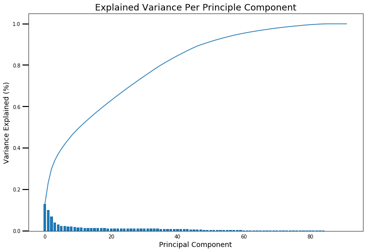
The way that PCA works is that it will always identify the component that explains the most variance first. It will then find the next component, which will explain the next highest amount of variance. That's what you can see in each of the blue bars - the height of each shows the relative amount (out of 100%) of variance that it has captured, and the height decreases slightly with each step. In technical terms, it does this by identifying orthogonal vectors. If we were to explain this in 2D space, if you had two vectors (think lines) that were at 90 degrees to each other, they are orthogonal. As we add more features, the dimesionality of the space that we are working with increases so it's possible to keep finding many different components that explain variance in the data while still maintaining orthogonality.
It's a bit hard to really look at the details here, but there are a couple of things that we can see from the outset. To capture all of the variance in the data, we needed around 85 components (the final number of features that I used was 92). So if we are really simplifying our data, this isn't much of a reduction. This is where the curve in our plot can also become useful. We can see that for the first number of components we see a very high increase in total explained variance. Then, around the 5th component, the curve becomes less steep (less variance explained per component), and then it really starts to flatten off around the 40 to 50 component mark. To determine how many components to keep, we want to weigh up how much additional variance we are capturing with each new component, while also considering the total amount of variance expalined.
To see this a bit more clearly, I made a 'zoomed in' version of the plot.
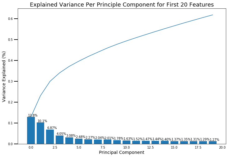
Now we can see exactly how much variance is explained by each component. If we compare with the larger version, around 20 components there is also a drop-off in the amount of variance explained. At 20 components we have also explained more than 60% of the variance in the data. I didn't want to create too many segments, because no company is going to be able to target them all, but I also wanted to make sure I had captured sufficient variability in the population to comfortably understand what was being captured. Twenty components is what I went with.
Once I had decided on the components, then the real fun could begin! For the first ten components I plotted out the weights of each of my 92 features. If a feature is weighted more highly, it is more commonly associated with that component. It is possible for features to weight either positively or negatively. Both 'high' positive and negative values are of interest. (Negative just means that that component is most commonly low)
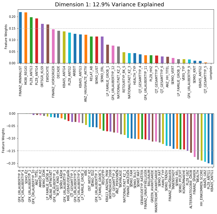
I used a weight of 0.15 (in either direction) as the cutoff for determining the highest weighted features. I would then inspect these to get an understanding of what underlying component might be captured. One thing that you might notice here is that the feature names do not seem to be very interpretable! That's because the names are in German! So a lot of consultation with the data dictionary that we were provided was necessary to understand what I was looking at!
Before we go any further, you've got a bit of a chance to "play along at home." If you'd like to use the information I've provided below to make your own guesses about what is captured by this component, click this button once to hide my answer. (Once you've made your guess, you can click it again to see what I suggested, the answer will be shown under "My Answer")
Here's what I found (data is for adults):
- High Positive Features
- FINANZ_MINIMALIST (Low financial interest)
- MOBI_REGIO (Movement patterns)
- PLZ8_ANTG3 (Number of 6-10 family houses in PLZ8 region)
- PLZ8_ANTG4 (Number of 10+ familiy houses in PLZ8 region)
- ORTSGR_KLS9 (Size of community)
- EWDICHTE (Density of households per square kilometer)
- High Negative Features
- KBA05_ANTG1 (Number of 1-2 family houses in the microcell)
- PLZ8_ANTG1 (Number of 1-2 family houses in the PLz8 region)
- KBA05_GBZ (Number of buildings in the microcell)
- HH_EINKOMMEN_SCORE (Estimated household net income)
- WEALTH (High negative: more likely poor)
- FINANZ_SPARER (Financial typology: Money saver)
- ALTERSKATEGORIE_GROB (Estimated age based on given name analysis)
High positive means that these features are likely to be high for this component. High negative means that these features are likely to be low for this component. If we assume that each component represents a certain demographic group within the population, what population group does this sound like to you?
My Answer:
Was your answer close to mine? To me, these sounded like young, college-aged students who are living in city apartments. They don't have that much money and they ended up moving along. They either don't have much interest in financial matters at the moment or are not very interested in saving.
I found it so cool to be able to use these components to successfully identify segments of the population that others could recognize!
Here are other population segments that I found:
- "Traditionally German" Elders
- Savvy Male Investors
- "Alternative" Rich Adults/Couples
- Working Class Families (with children)
- Affluent Families (with children)
- Wealthy Professionals (with titles)
- Working-Class "Newcomers"
- "Newcomer" Elders
- "Newcomer" Families (with children)
If you're wondering about the "newcomer" designation, one of the features measured the likelihood of the name being "German-sounding", "Foreign-sounding" or "Assimilated". The last three components we all highly positively loaded with names that sounded foreign or assimilated, and negatively loaded with names that sounded German.
You would think with all the work that we have done up until this point we would be finished, but there is one more step to go - stay with it!
KMeans Analysis
This was my final step. Once I'd separated the data into dimenions, I needed to collect the data that is found on these dimensions. One way to do this is to use the KMeans algorithm that uses the distances between points to find a certain number (K) of clusters within the data. There are a number of ways to decide what K is, but in this case I used what is called an 'elbow plot'.
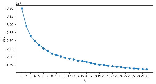
This plot shows us the amount of error (SSE) associated with each number of clusters. It is preferrable to once again balance the number of clusters with the reduction in error. I chose to use eight clusters because I wanted a few more, based on the segments I had found above, but I think six would have also been reasonable.
Once I chose the number of clusters I wanted to find (reminder, this was 8), I then applied all of the steps I had completed with the population demographic data to the customer demographic data. I cleaned the data, standardized it, and used PCA to create the 20 dimensions/components. I then used my KMeans function to predict the label (0 to 7) of each data point for both the population and customer data. I also added the missing data that I had excluded back in to create a ninth label.
Then, I compared the relative proportions of each label between the population and the customer data.
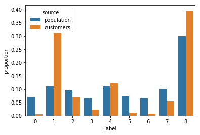
As you can see, there are some substantial differences in the numbers found in the different labels between the population and customer data. For example, for Label 0, there are much fewer customers than people in the general population. In comparison, there are many more customers with the second cluster (Label 1) when compared to the population.
Who are these people, you may be wondering? If you are, that's a fantastic question!
To determine this, what I did was compared the feature averages of these groups with what I had found in the PCA analysis. I was able to identify that people that were covered by the first label (Label 0) had characteristics that most matched those of the first component I had found - City-living Youth. The second label (Label 1) most closely matched with the "Traditionally German" Elders that I had found!
This makes sense both in terms of how PCA had split out the data, but also makes logical/practical sense. The customers we were looking at were customers of a mail-order company. Based on what you know about college-aged youth, it seems reasonable that they would be less likely to be customers of a mail-order company. By contrast, it also seems reasonable that older folks are more likely to be customers of this more traditional version of shopping.
Wrapping Up
And that, my friends, is PCA! It was an incredible amount of work to get this done, but I really enjoyed watching the data come alive with the analysis. One of the other applications of PCA is to use it to verify that surveys are actually measuring the underlying constructs that they are intending to measure. This is what I was doing when I originally learnt factor analysis (the statistical equivalent of PCA) and I look forward to trying it out one day!