Learning R

I've always thought I have done ok at data visualization, but as I learn more, I become inspired by what others have done to make visualizations magnificent. For what I consider to be 'data as art,' you can check out this article, but today, I'm working from one from Gapminder that set a bar for me.
This is all, "brought to you courtesy of learning R in my second term." (oh yeah, I passed Term 1!)
The Big Picture
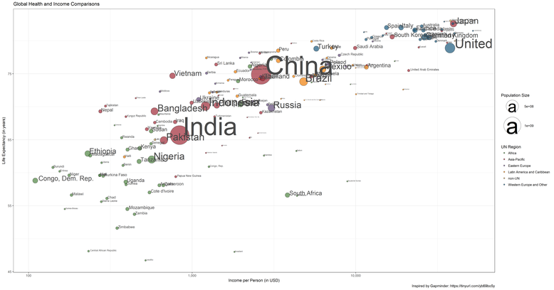
First of all, the data is from 2011, so if some of the placements of countries seems a bit off, this could be why.
It's a bit tough to get it all in there, but what you're seeing is a comparison of indicators of country health and income across the globe.
The x-axis is a log scale, with country Gross Domestic Product (GDP) per person in US$.
The y-axis is a measure of health of life expectancy at birth, in years.
Countries to the right are richer, and countries to the top are healthier.
The bubbles themselves are scaled to represent differences in population, with labels to help you find some of the countries.
(I wasn't quite fancy enough to get them all not overlapping)
And finally, the colours represent the UN designated region that the country falls into.
Phew! That's a lot to get in there!.
It becomes interesting to see some of the trends. You can see that there is clearly a relationship between a country's wealth, and the health of its people.
But there are also some fascinating (in a sad way) outliers from this trend when it comes to life expectancy, such as Equatorial Guinea, South Africa, and Swaziland.
You can also see how the UN classification does provide an approximate grouping of a country's developmental status, with the same color dots often found near each other.
Now to zoom in some!
The Bottom Third
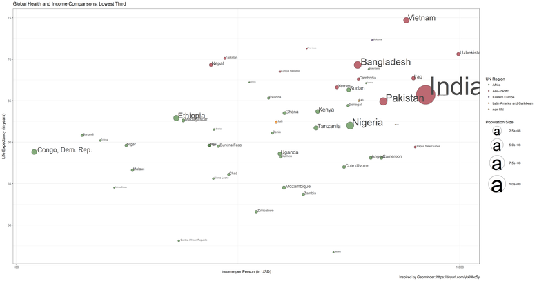
Now we really start to see the continental concentrations.
The vast majority of countries in this third are from Africa.
There are also no countries from the Western Europe and Other region.
As we zoom in, we may also notice that while the groupings do tighten up some when we get to the top third, the general slope of the line remains relatively consistent.
We will also discover that the region that has the greatest span through the ranges is the Asia-Pacific region.
The Middle Third
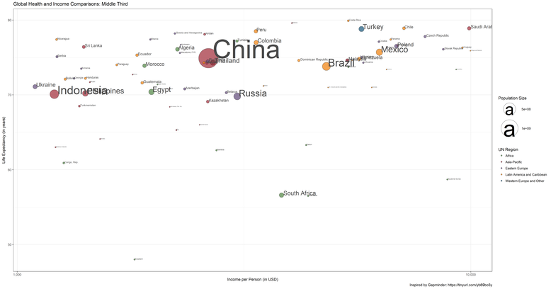
In this third we have the greatest variety of UN regions represented.
Most of Eastern Europe is found in this third, as is a substantial amount of countries from the Latin America and Caribbean region.
Turkey is the only country from Western Europe and Other that is found in this third.
This third also has a large number of very small countries, suggesting a potential impact of country size on the ability to grow in wealth and other infrasture that promotes health.
The Top Third
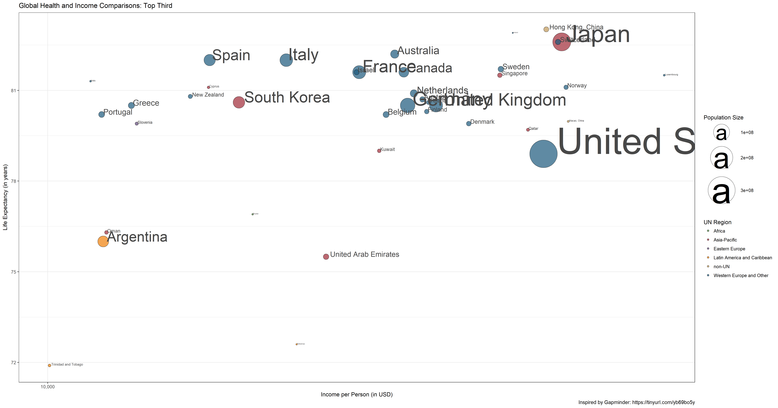
In this third we find the richest and healthiest countries in the world.
The country that is found at the fartherest reach of the scale is Luxebourg.
Argentina, Trinidad and Tobago, and the Bahamas back it into this third for the Latin America and Caribbean region.
Slovenia is the only Eastern European country in this third. Brunei is the only African country included.
Perhaps one other interesting observation is that despite being at the very far end for income, the United States has a lower average life expectancy than all other Western Europe and Other countries.
And now for something really special...
If you liked that exploration, check out this transformation to include time in the considerations, and watch the countries develop over history!